While doom-scrolling youtube I stumbled onto an interesting discussion around trading card game design (TCG) and the importance of the relative positioning of data points on cards. Have been resisting any serious graphic design overhaul until i have a finished game – but I couldn’t resist the urge to tinker with the current card templates.
What an improvement re-structuring the card makes!
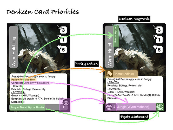
The keywords are demoted and attached to the title.
Parley now has a “white flag” and is promoted first – which is good as this is the first option you have when meeting a denizen. Makes it so much easier to remember that a peaceful resolution might be an option.
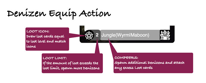
The loot icon, loot limit, and Compeer statement combine into a simple readable action – so much better.
Gearing up enemies and working out the details of a combat encounter are much clearer with everything in one place in the correct sequence.
Your draw loot and match the “loot icon”. If you exceed the “loot limit” you spawn friends using the “compeer statement”.
Talking of loot cards…
Loot Cards
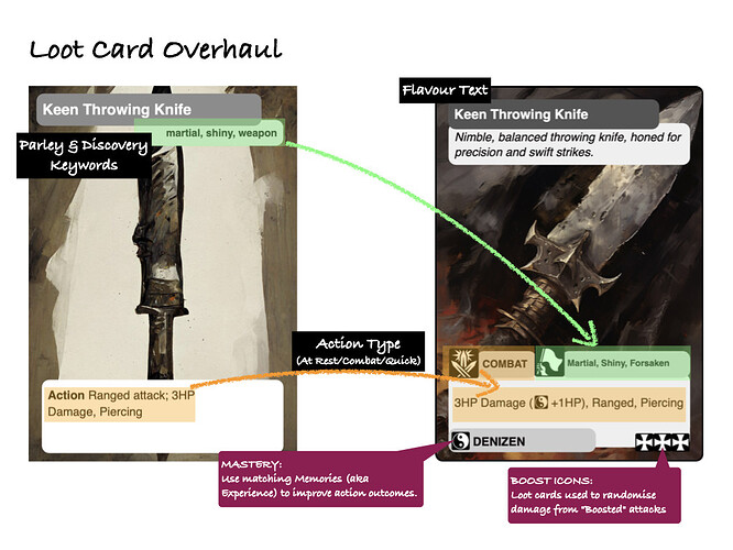
Loot sees heavy use throughout the game, but the card format hasn’t really seen any love in 6 months.
The title and flavour text are isolated and much more readable. Each card has a clear indication of when it can be used, and the keywords are highlighted with the Parley symbol helping to link them to that action.
Mastery and Boost options run cleanly along the bottom of the card.
Other card templates have had a bit of a touch up as well, but I might touch on those when talking about specific features of the game.
Till then, I’ll keep on developing ![]()


